LA CREPE HOUSE
The mission for this project was to create or change the graphic chart of a compagny, work with acompagny that exist or create one. For my side i have a friend who had the idea of building a crepe truck in Paris. I talked with him about the project and he played it like it was real and he was my client and i was the graphic designer. I also like food so i was right inside, playing with some texture and food element. Its the first time that im doing this type
of work where i need to be really close to my client. So, we had “buisness meeting” when Hugo and me were free we took the right time to talk about the project, about what im doing, showing him some drawing especially for the logo and taking decision about this and that. It wasnt easy but i really liked to work this way and doing this project.
He might using my work in the future.
- LOGO -
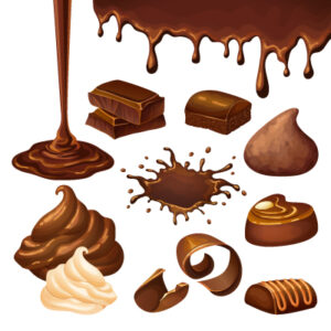
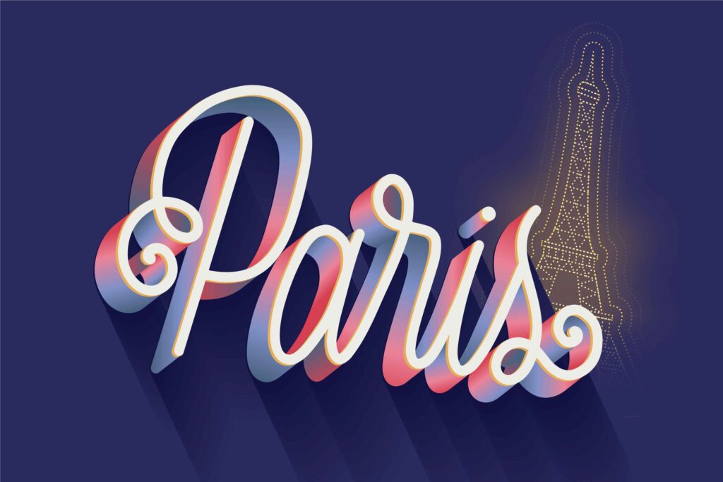
inspiration board


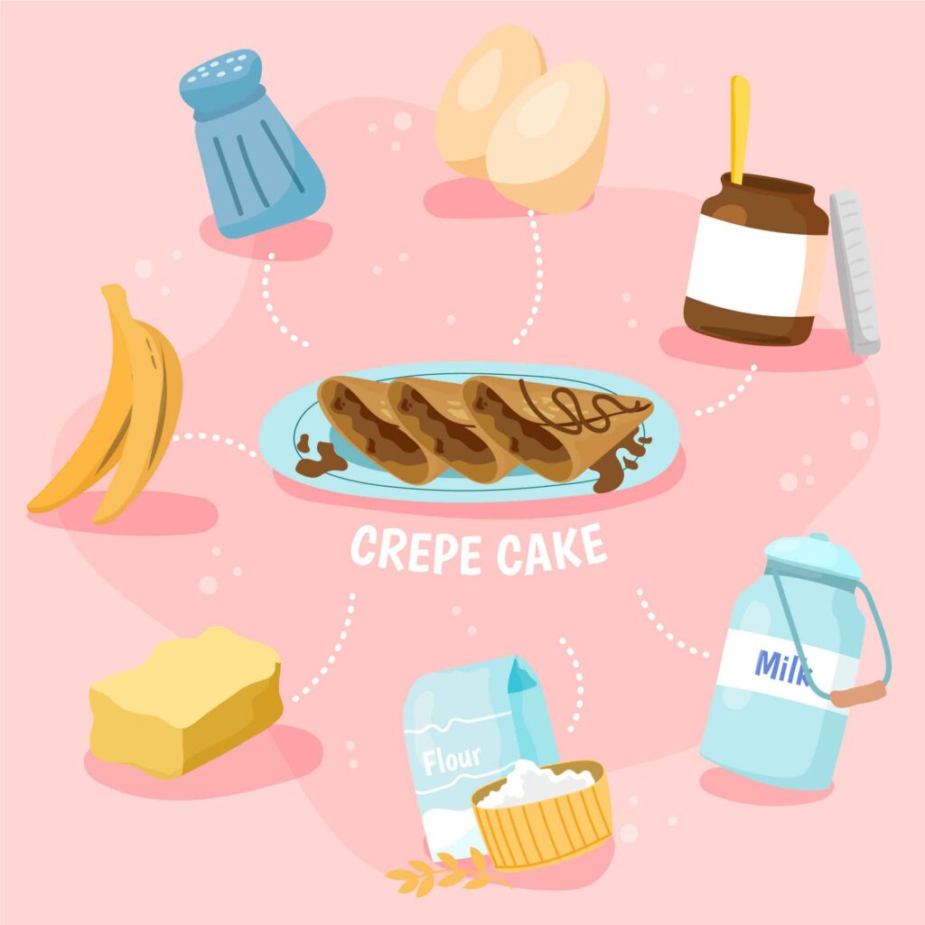
DISCOVERING
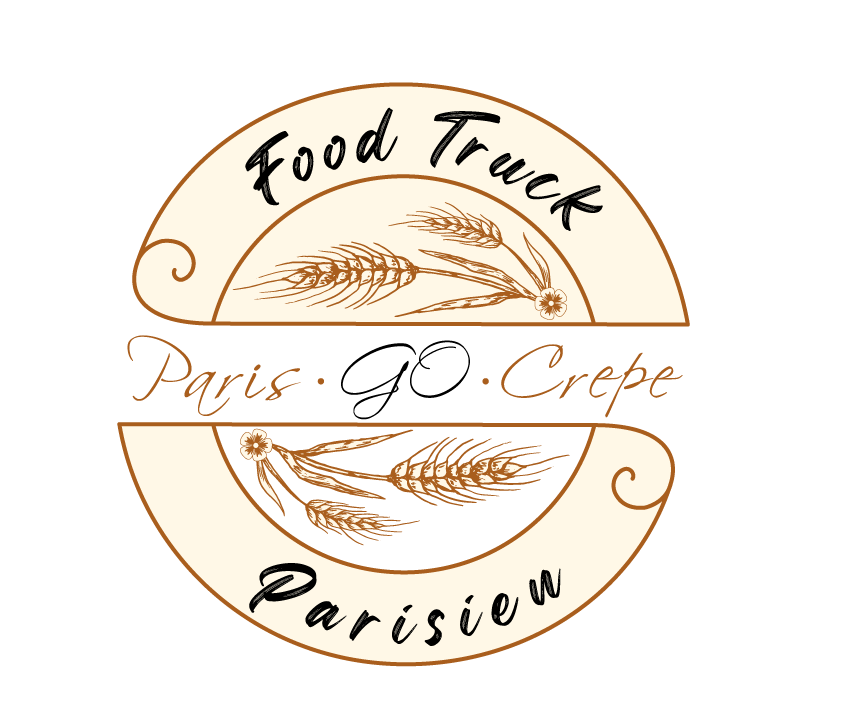
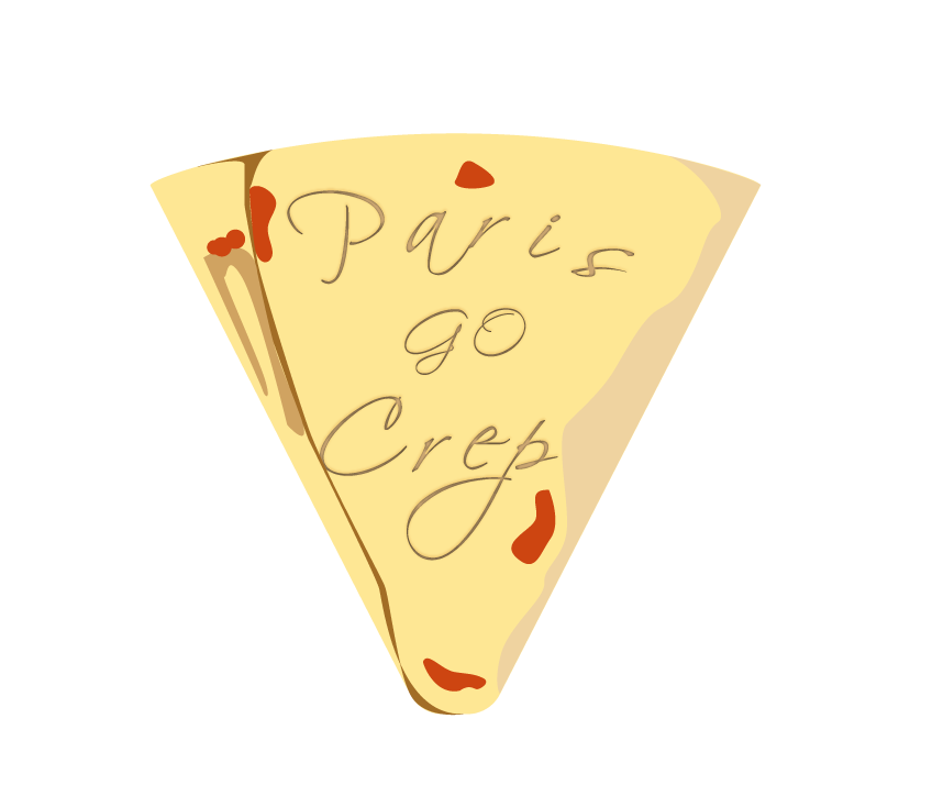
Those are my 3 logos that i show to my client. You can tell that the name of the compagny is not the same, and you right. We, me and my client
talked about it and the conclusion was that the «go» of «Paris Go Crepe» is not that good for a name of the compagny because its a
term withpejorative connotation to designate a native or an inhabitant of Paris. I helped him to find
another name with the word «crepe» inside. The third logo was the one that he looked for.

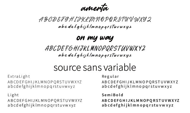
Also, the client wanted to use a handwritten / calligraphy font, to represent Paris.
I tried to create my own font but the time was running and the client was
okay to use a font that already exist. Amerta.
FONT
DEVELOPING
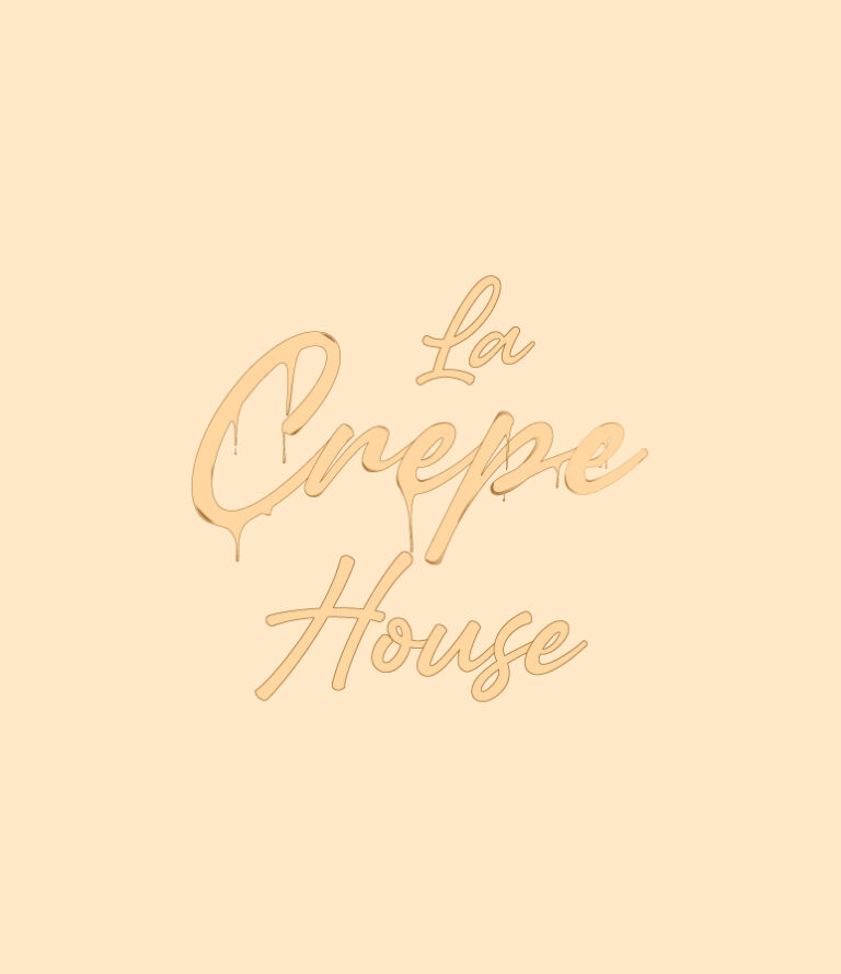
This is the first developement of the logo that we chosed, so basically, i added texture on the word «crepe» because thats the word that the client wanted to show the most. I create the melted texture by moving some chosen vector point and make it melt. And color, the client wanted a cream color palet in reference to the dough of the crepe and how the crepe look when you cook it.
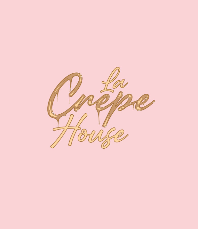
How we can see it here, i played much more with the texture, i insert more than one layer of different color to make it realistic as possible. I approach the «l» from the «e» of «crepe» because in the french grammar there is a hat «ê» on top of the e and to make it equal i also approach «house» from the middle. The texture is only on «crepe»
because i wanted to ask the client what he think about it, if its better like this or to put the texture on everything.
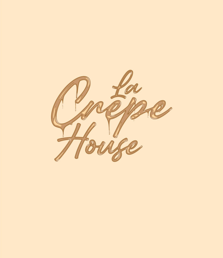
He prefered it like this, the texture on all the words but to make it less heavy (visually speaking) i did add texture on the two other words but with less detail and no melt because we still want the word «crepe» to be above the others. I tried to add a texture from above, like a caramel texture the client didn’t like it.
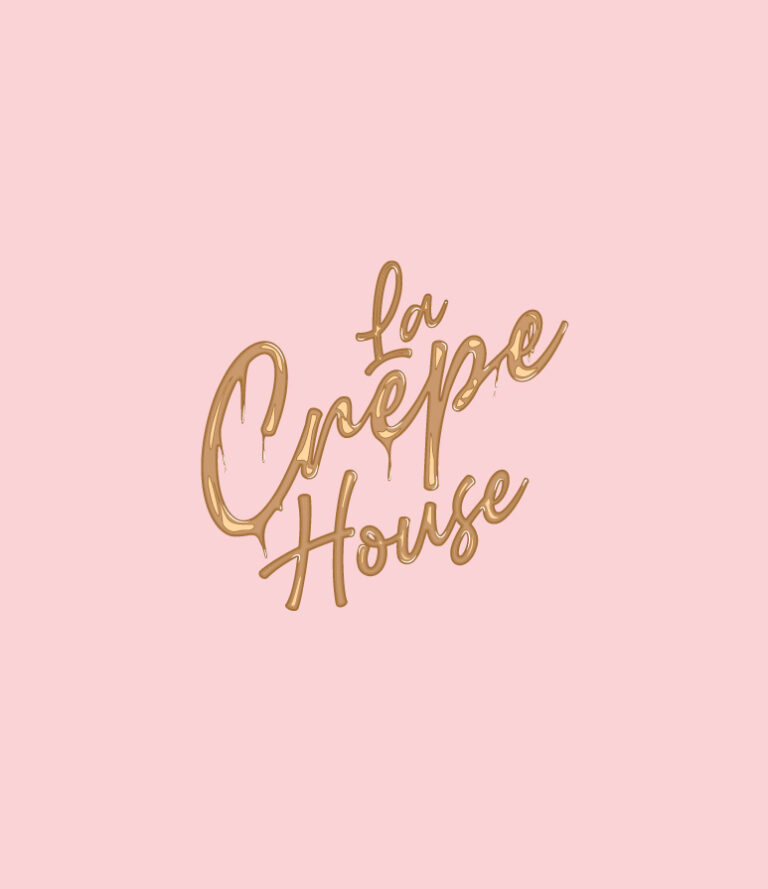
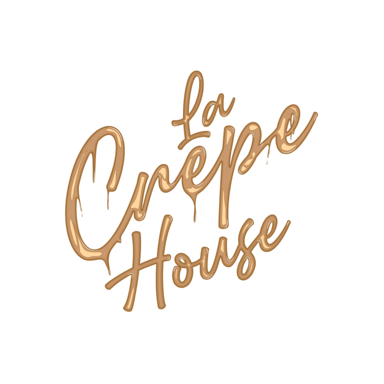
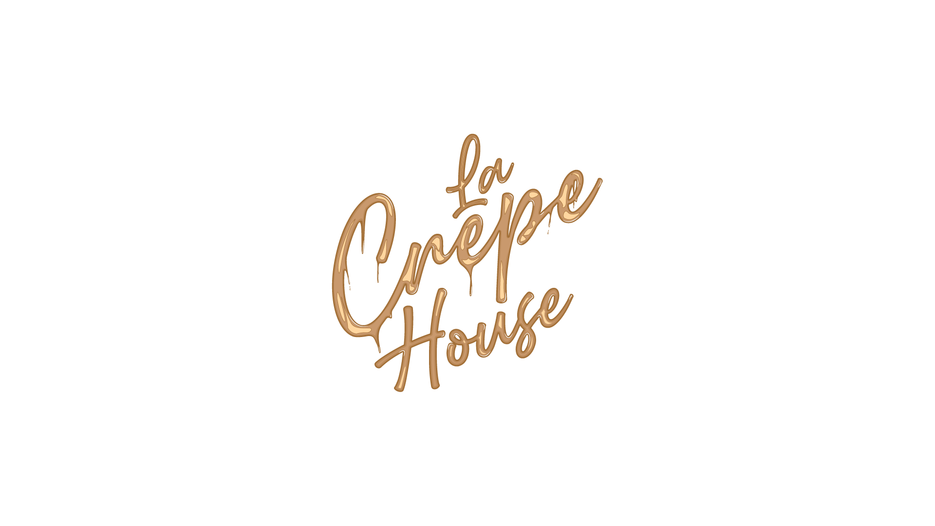
This is the final version of the logo. What’s different? I bend it about 26° left and voila. This look more like a signature and more real than the straight version. I had the confirmation with the client and my teacher. You may not see it but the melted part whos falling were falling in the angle of the previous version so 90°. When i bended it i
also needed to making again the melted part to make it fall at 60°.
LOGO
